
Redesigning DoorLoop’s Get Started flow so that a customer with 10 doors and a customer with 300 can both import their portfolio in one sitting, readable, editable, and accessible at any size, without a specialist doing it for them.
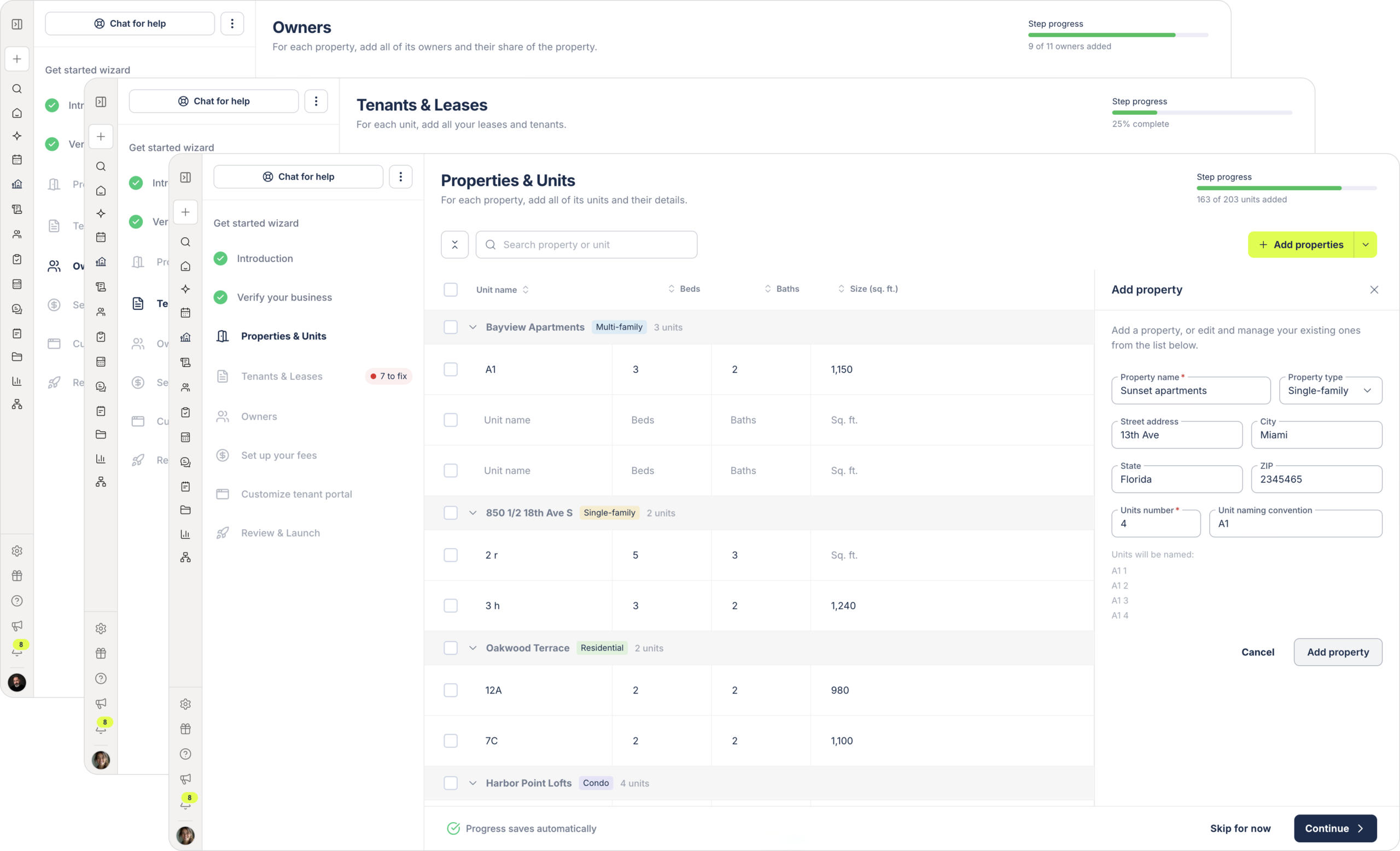
Overview
DoorLoop is a property management platform. Before a new customer can collect a single rent payment, they have to get their whole portfolio into the system: every property, every unit, every tenant and lease, every owner, plus banking details so DoorLoop can charge on their behalf.
Get Started is the flow that carries that. It’s the first working hour a paying customer spends in the product, and in 2026 it was the thing making them regret signing. I designed the data import half of it: properties and units, tenants and leases, and owners.
How Get Started works
Rather than adding properties one at a time into the live platform, Get Started collects everything in a setup mode first, a sandbox that doesn’t touch the account until the customer presses launch. Then it all goes live at once.
Onboarding specialists sit with customers through this, usually on screen shares, so a specialist is the first person to hear when something breaks.
Research
“I literally had to say, just click that. Don’t pay attention.” An onboarding specialist had to tell a paying customer to ignore the product’s confirmation screen.
The problem
• Nobody breezes through. Four or five accounts on the new flow, every one needed help.
• Sessions don’t progress. On the old flow he could leave a customer to finish a few properties alone. Now he comes back to find them exactly where he left them, unable to proceed.
• Accidental typing traps you. Start filling a unit, change your mind, and the form demands a rent amount. Clearing it needs a three dot menu on the unit line that customers don’t find.
• The table is too dense to read. Hidden dropdowns, no clear line between property and unit. One customer added the same tenant twice because she couldn’t tell the units sat in different properties.
• Warnings without recourse. The flow says what’s missing but not how to resolve it, and past ten leases, sorting through them is its own task.
Why it mattered
“You just bought a car, you take it out, and it stops, and they say, don’t worry, we’ll put a new battery in. You have a very bad impression right off the gate.”
Goals
User goal
Business goal
Scalability Goal
Design challenge
Key Decisions
Replaced the dense, collapsed table with a spaced, line-by-line view similar to existing leases and tenants screens. Now, each row clearly shows property, unit, tenant, and rent for quick review.
Scattered warnings are gone. A persistent counter now shows how many fields need attention and guides users to each issue, so nothing gets missed.
Typing works for small accounts, but not for thousands of units. Users can now upload existing data files. An AI step scans and autofills properties, units, tenants, leases, and owners. Large portfolio customers review and correct instead of entering every row manually.
Errors from both AI uploads and manual entries are handled in the same way. All issues are surfaced in a single system and fixed through the same counter, streamlining the experience for everyone.
The design
Built as a working prototype rather than static screens, so the table behavior, the bulk actions, and the error stepper could be tried rather than described.
Properties & units
The full step, with bulk add, inline editing, the error stepper and file import
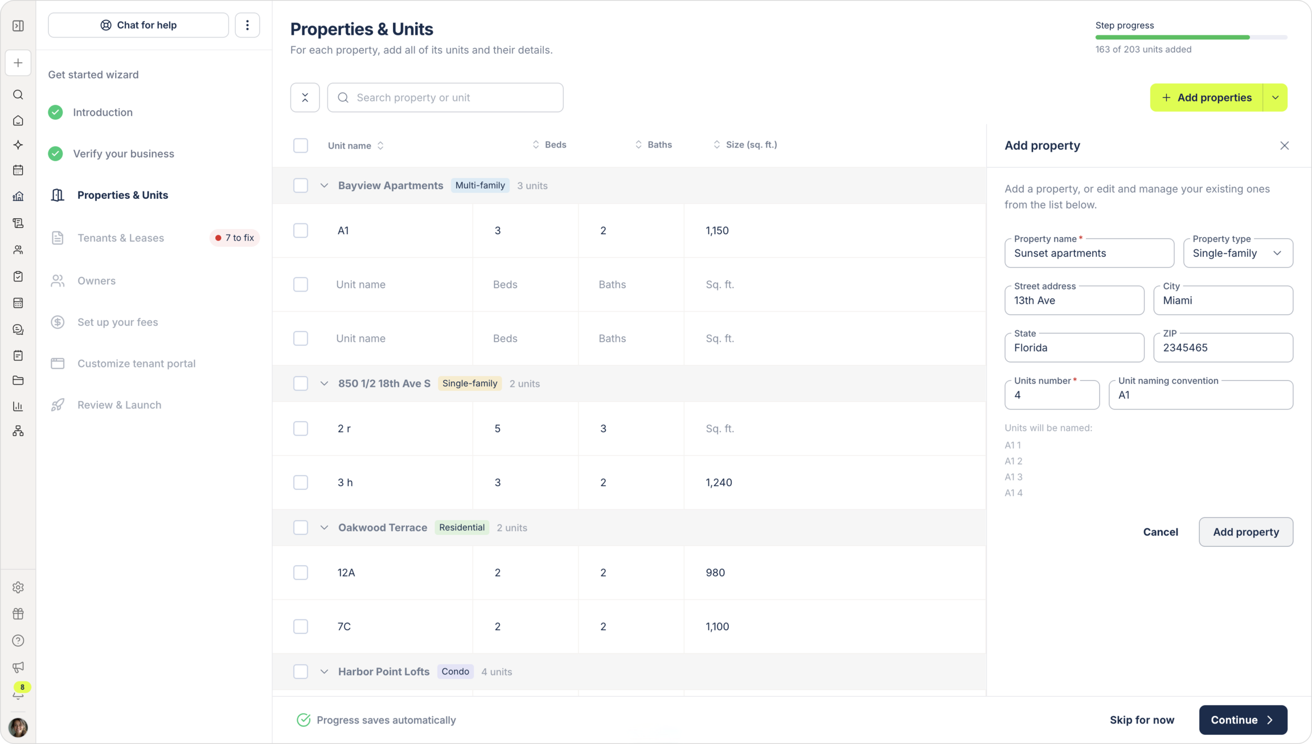
Properties and units flow: Add property.
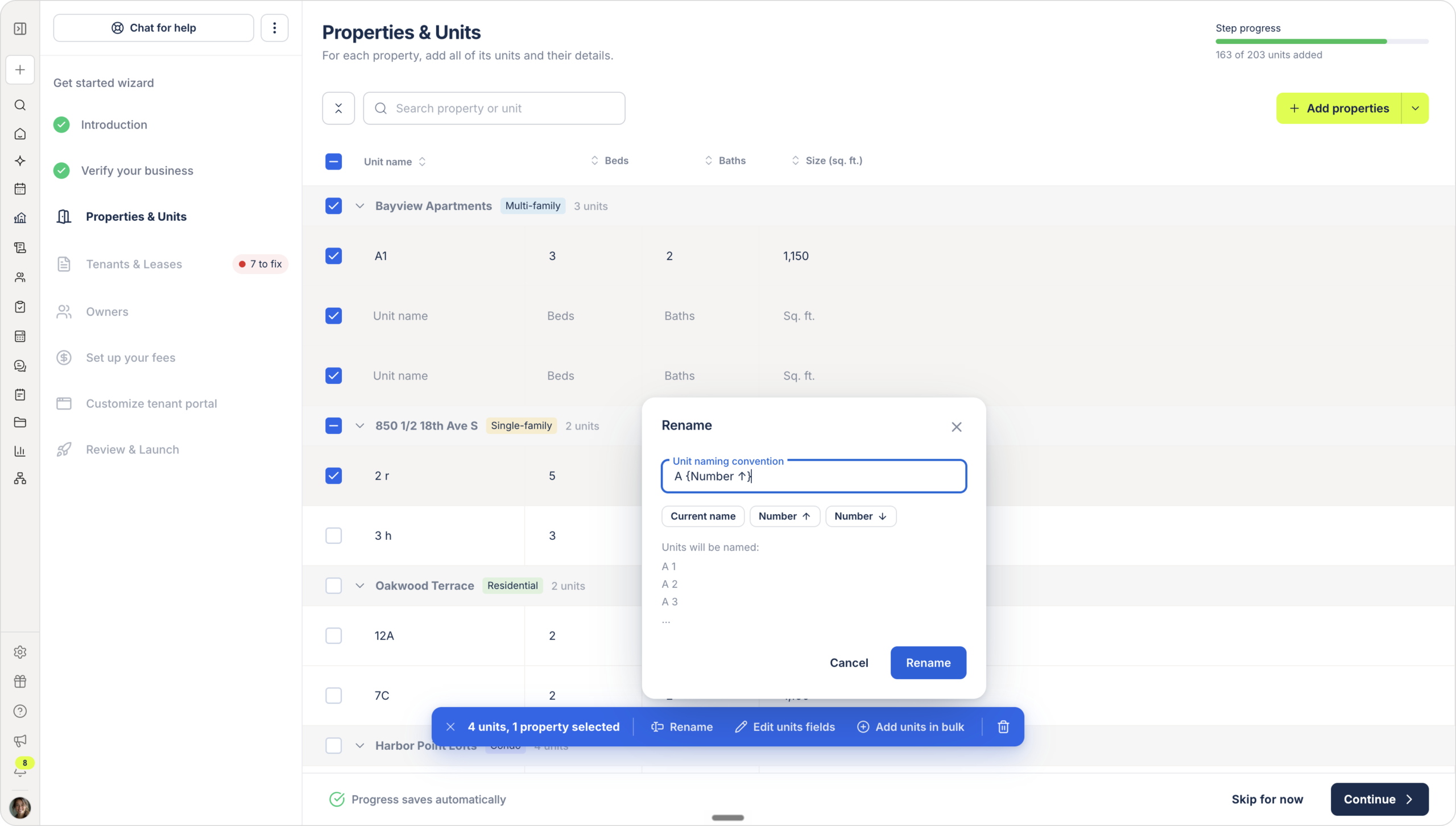
Rename bulk action.
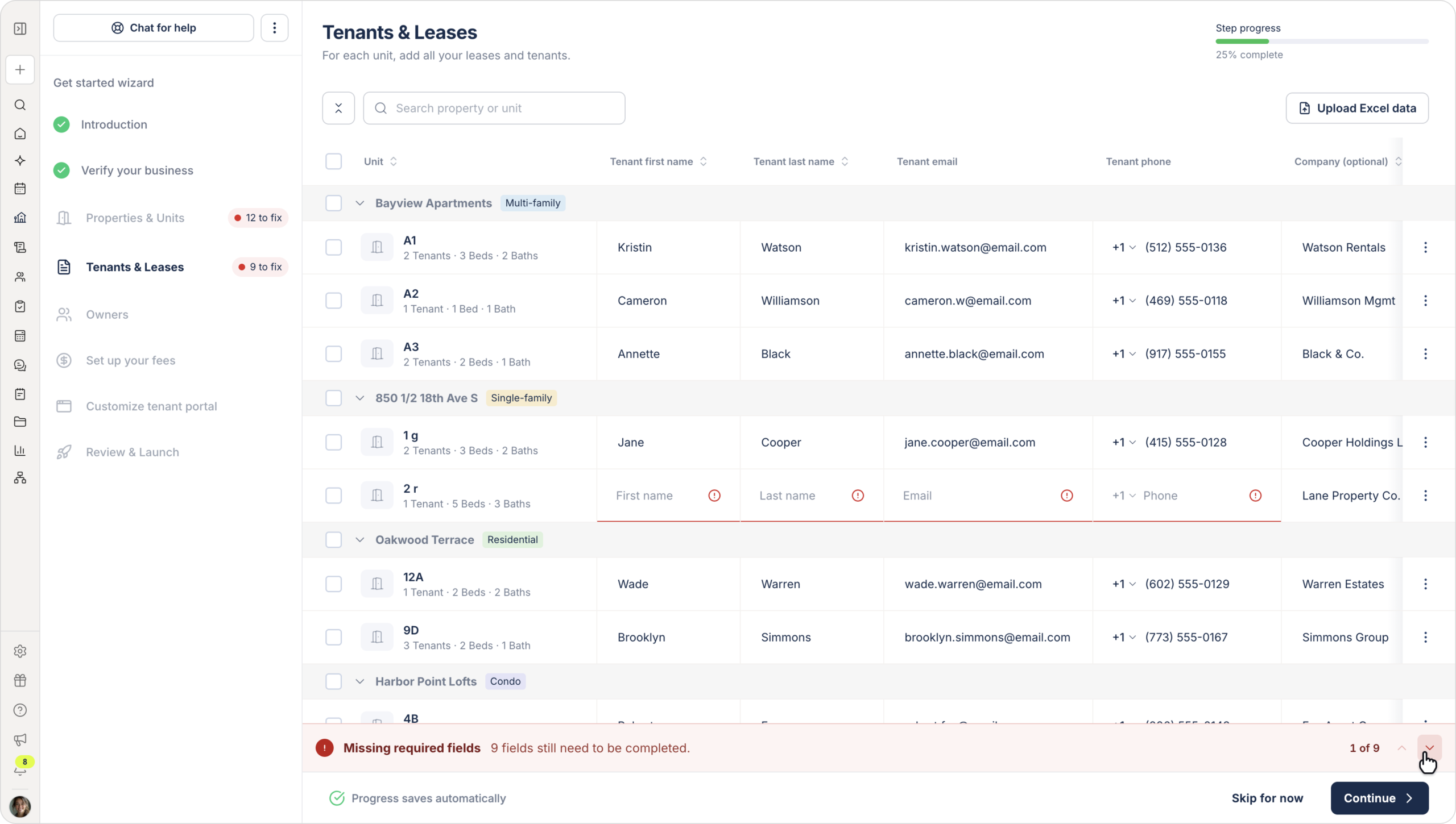
Missing fields flow.
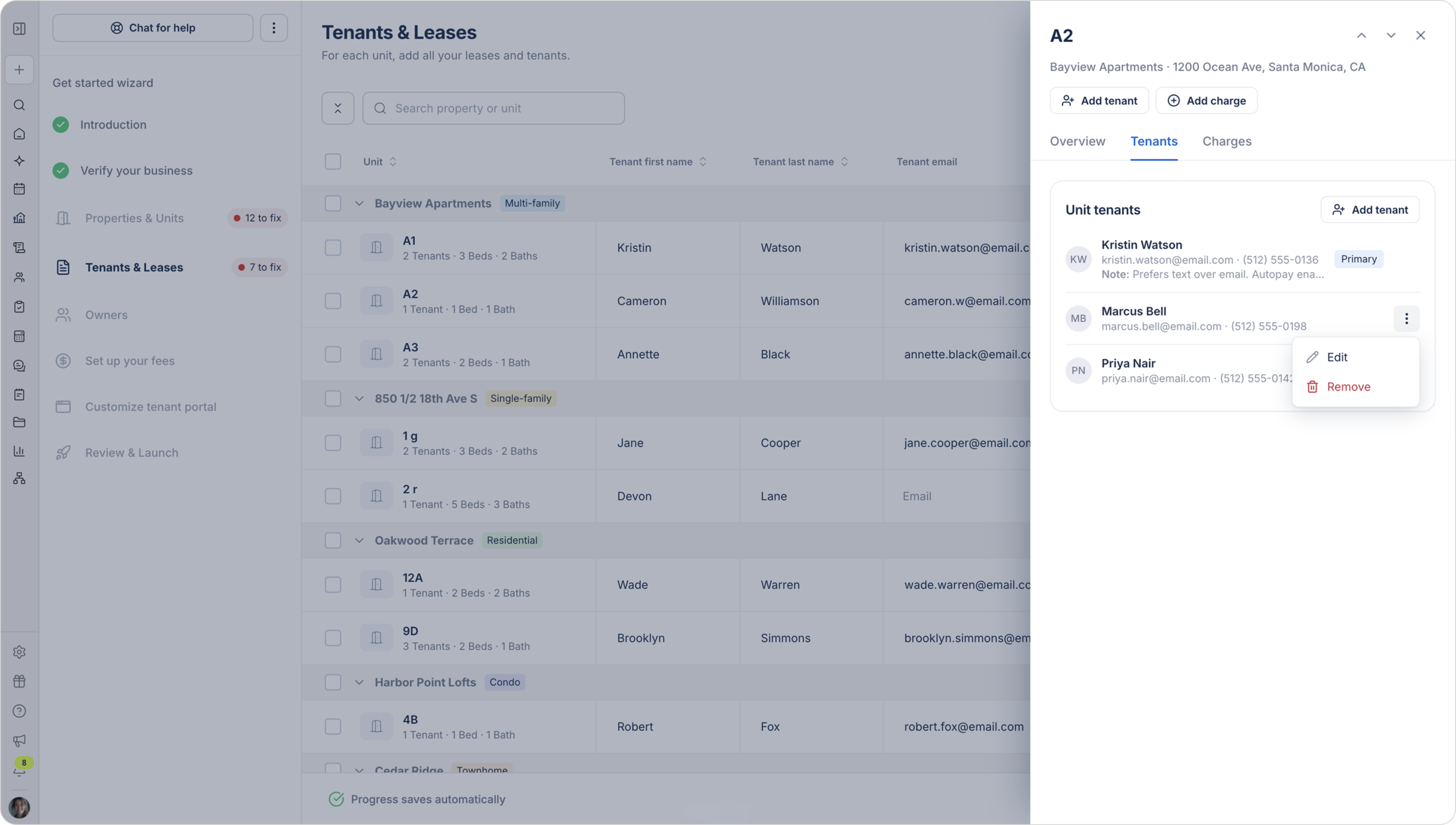
Tenants and leases step: quick view side menu.
Design system contribution
Scaling this flow to hundreds of entities required components that the platform didn’t have. Four came directly out of this project:
All four were built to be reused wherever the platform needs a similar pattern, not just inside Get Started.